")


")

There’s one page on your website that you’re probably overlooking—and it could make or break your next lead.
It’s your 404 page.
You know that dead-end page that comes up when you’ve clicked a broken link? That’s a 404 page.
Every website has one, but not every website has a custom one. Today, I’m sharing why you need to customize yours, showing you plenty of 404 page examples for inspiration, and covering best practices to follow so you can get yours done properly—and improve your SEO along with it.
By the way, have we met yet? I’m Shannon—SEO copywriter helping small business owners and hospitality-focused brands make their websites more profitable.
Here’s why I include a custom 404 page in my website copywriting package.
Why You Need a Custom 404 Page
There’s a roughly 100% chance that your website will include some broken links at some point.
Your business grows and changes, you add new content, you misspell a URL slug, you update the name of a page or two…
And BAM! Somebody unexpectedly lands on a page that says: “404 Page Not Found.” Annnnd nothing else.
Not helpful, not cute, and probably not giving your website visitor a reason to stick around.
Even if the person browsing your site was excited to book you, they are not likely to click the back button and try again or dig around your site in hopes landing wherever they originally intended.
Which means that broken link (and very unhelpful 404 page) is now a dead end. That person will click the “X” button on your site and move onto the next option. And that teeny tiny broken link has gone from an “oopsie” to a lost lead. Yikes.
But if you had a custom 404 page in place and that same website visitor clicked a broken link, what would have been a dead end is now an opportunity.
When you customize your 404 page, three things happen:
- You provide a more helpful user experience on your website,
- You have the chance to show your personality,
- And you give the visitor helpful resources, keeping them on your site longer than they would’ve been otherwise—which Google LOVES.
When people stay on your site longer, it means they’re engaged in your content.
Which means you’re probably a reputable and helpful resource to your website visitors.
This tells Google that people trust you and look to you for answers, meaning it’s more likely to rank you higher in search results.
That’s a lot of ROI for one little headline and a few links, don’t you think?
404 Page Examples
There are good custom 404 pages and not-so-good ones. So, I want to show you some 404 page examples with my personal rating (Poor, Not Bad, and Best) and why they do or don’t work before we get into best practices for writing your own custom 404 page.
Canva
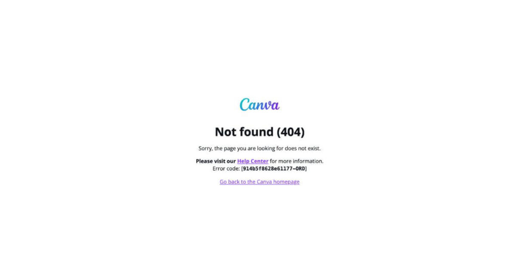
Rating: Poor
There’s a lot of text at competing sizes, making it difficult to know what to read first. Which makes the page overwhelming and the user click the “X”.
You’ll also notice there’s no navigation on the page. So when someone wants to click around to start their search again, Canva hasn’t made it easy for them to do so.
Rhode Skin
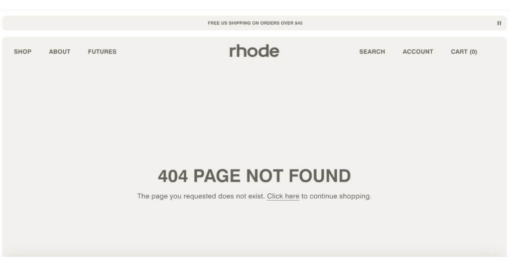
Rating: Poor
Ecomm websites haven’t mastered the art of the 404 page. In my search to find 404 page examples, every ecomm company I came across had one I’d rate as “Poor.”
Un-interesting headline? Your visitor won’t be sad about it. But no quick links to popular products or whatever bundle you have? It’s a missed opportunity. Even if they return to their hunt for the perfect product, their helpful experience on your site has been tarnished.
My best tip is to make it easy for them to purchase.
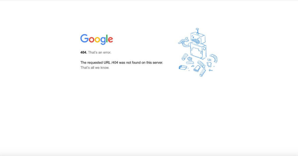
Rating: Poor (but also funny)
Ironically, Google’s 404 page is awful.
But they’re Google. So this page probably doesn’t get seen very often. And if it does… they’re Google.
But you’re probably not Google. So don’t use theirs as a guide for your own. 🙃
Chobani
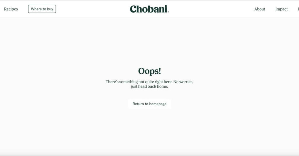
Rating: Better
Clear headline ✅
Short, supportive body copy ✅
An obvious next step with the “Return to homepage” button ✅
Navigation intact at the top of the page ✅
But there’s nothing special about it.
Your 404 page gives you the chance to surprise and delight your visitors in a place that would’ve otherwise been a point of friction.
WordPress
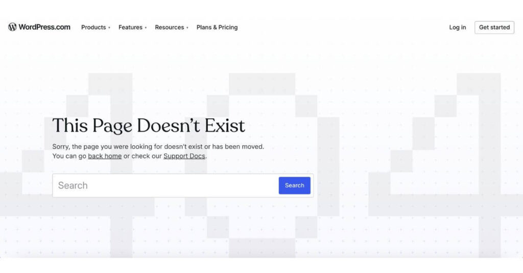
Rating: Better
WordPress has a simple, clear 404 page. And whenever you’re in doubt, you should prioritize clarity over cleverness.
But I wanted to share this one because of the search bar. It can work for some websites like WordPress that have a massive library of resources on many specific topics. But for most small business owners, the search bar won’t be as useful.
Even if your visitor knows what they’re looking for, the term they search could lead to yet another dead end or to a list of resources that they’d have to sift through—which can be quite a daunting task.
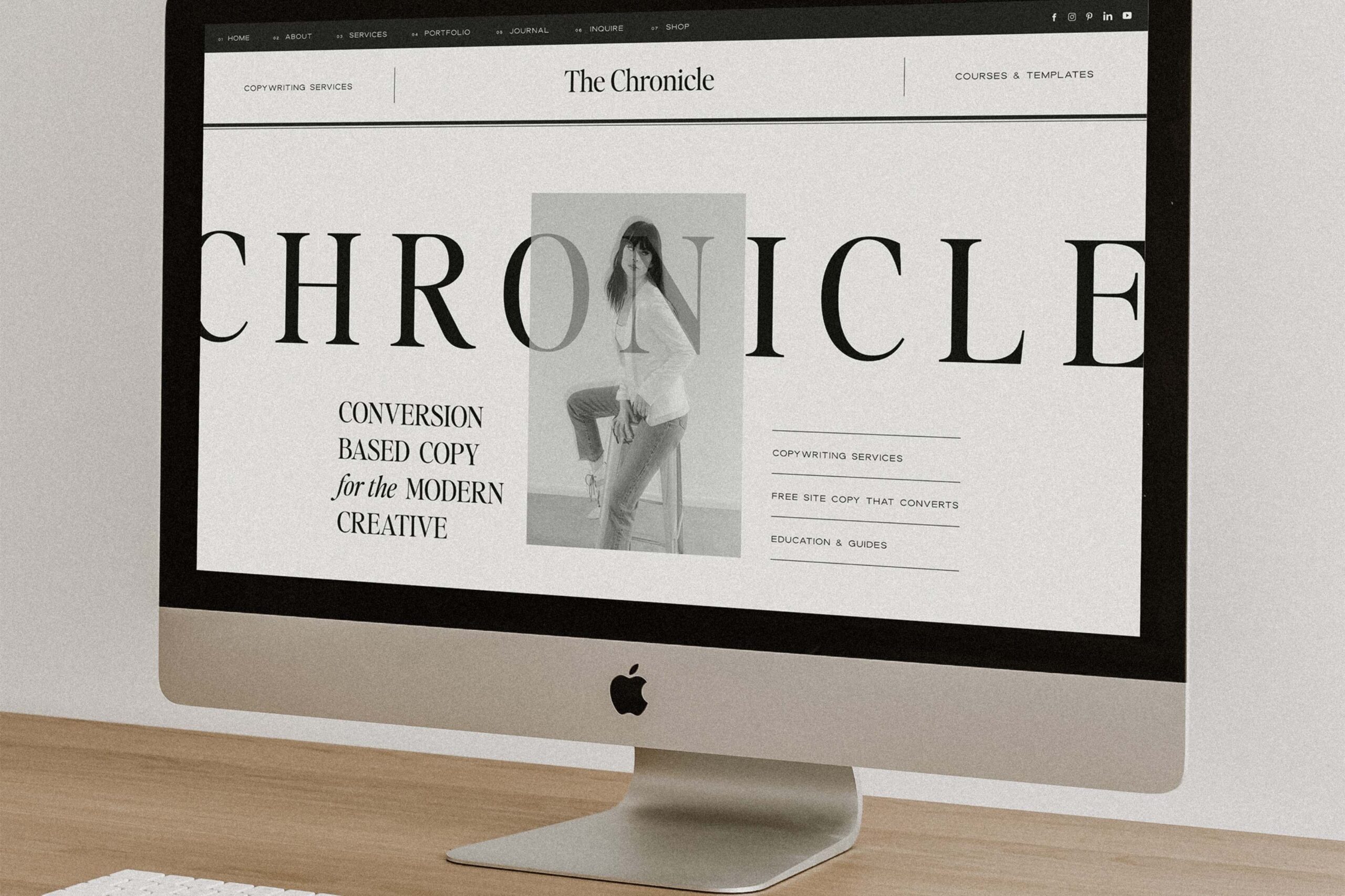
Showit
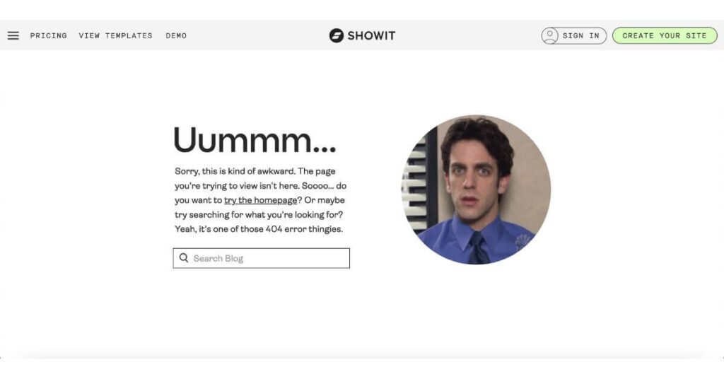
Rating: Best
If you know and love Showit, you know their brand voice is a bit cheeky and fun—especially that of their support team. They regularly use gifs in their messages to their customers, which is probably a very intentional move to make an often-frustrating or overwhelming task (launching a website—possibly with little tech or web design experience) into an experience that makes the customer smile.
The same goes for their 404 page. The “Ummmm…” draws your attention because, like our other 404 page examples, the headline is usually something like:
- “Oops!”
- “Something went wrong.”
- “That page is missing.”
- “That page can’t be found.”
This one’s different, so it immediately draws you in, makes you smile, includes a gif that’s consistent with their other communications, and has a search bar specific to their blog since someone lost on their site was most likely looking for a specific tutorial.
Truly, a masterclass in the art of the 404 page.
404 Page Best Practices
- Keep your content above the fold.
All of these 404 page examples have all their content above the fold (in other words, you don’t have to scroll to get the info you need). People have landed on this page as a mistake, so they won’t be scrolling around to find what they were looking for. It all should be front and center, ready to guide them toward the next step. - Add personality.
Turn an “oops” into a moment that makes them smile or laugh or reinforces that your skillset is necessary for them. - Skip the search bar.
Offer a link to your blog or most-loved resources instead. They’re more direct than an index of content to sort through.
One Last Step Before Publishing Your Custom 404 Page
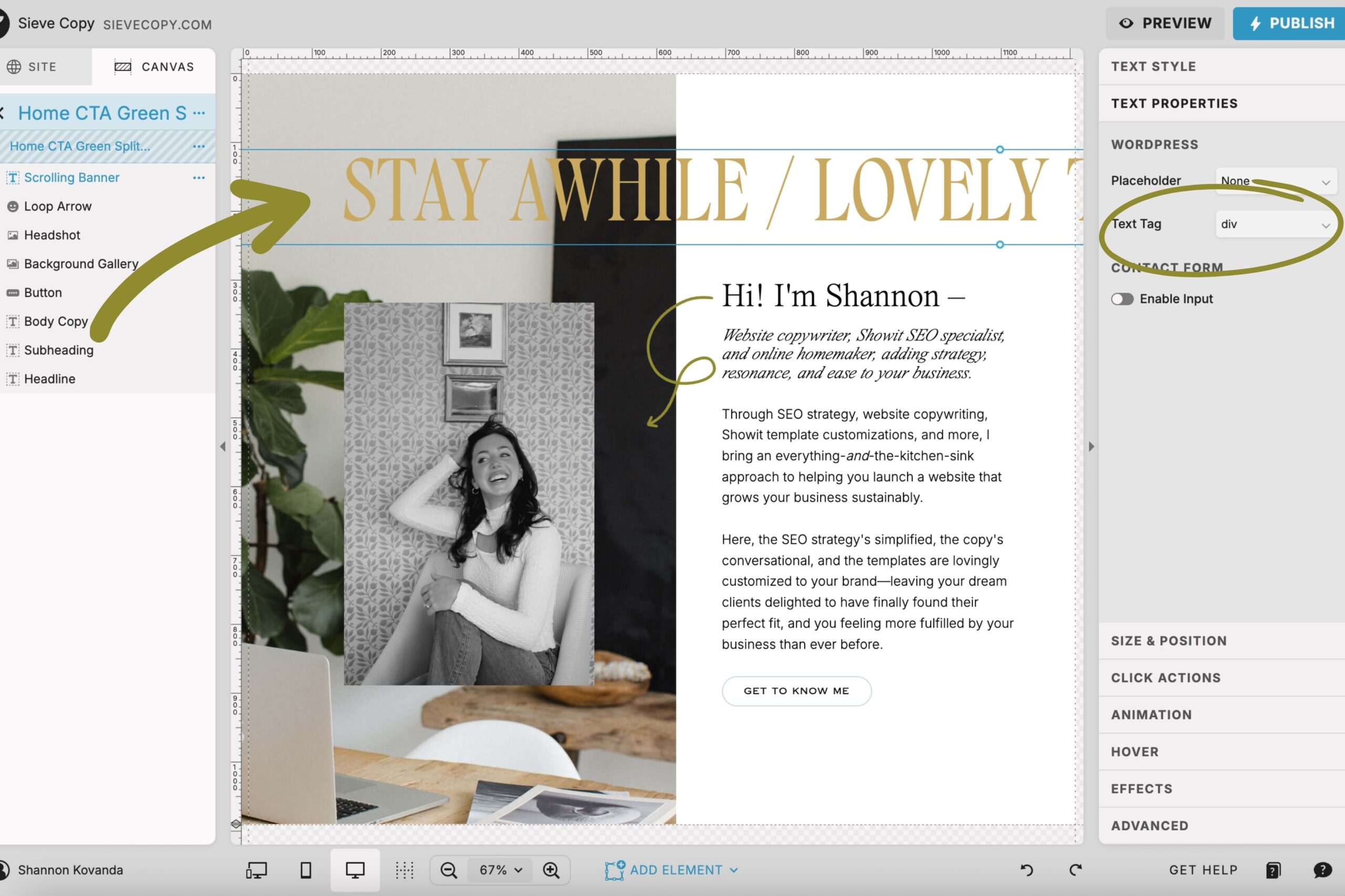
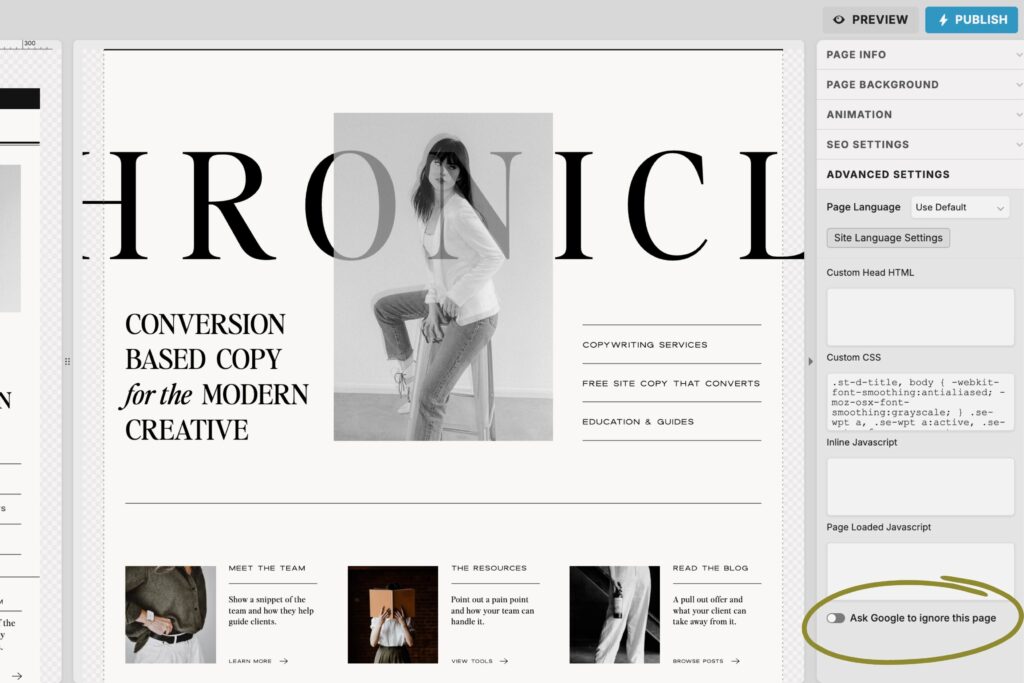
When you’re done, don’t forget to set the page to no-index to block Google from listing it in search results. Because if someone is searching for a business like yours, you don’t want them to find this page instead of one of your primary pages.
If you use Showit, you can find this under “Advanced Settings” on the right side panel. See the highlighted spot in the image below:
I hope you found this helpful and learned some 404 page best practices so you can create a better experience for your website visitors and give your SEO a boost.
For more support with your website:
- Keep reading the blog for more simple, helpful tips like this one.
- Subscribe on YouTube for simple Showit SEO tips, live copy audits, and making your website better.
- Browse my SEO copywriting services to see how we can work together.
+ view the comments